1aJob Mobile App Design.
A mobile recruitment experience designed to make connecting job seekers and employers more focused, efficient, and intuitive.
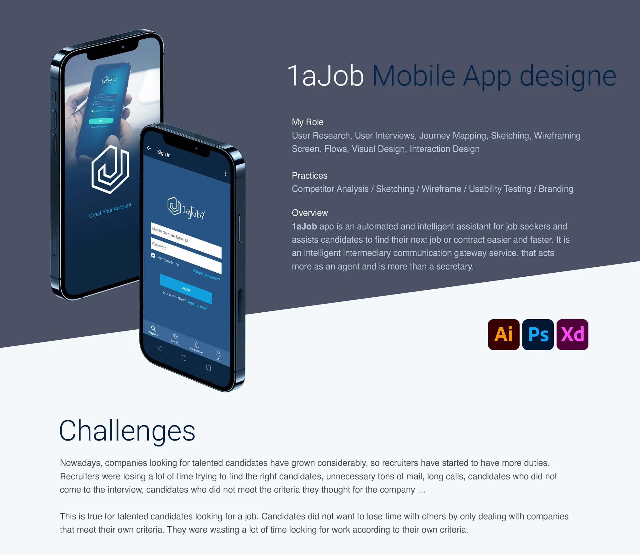
A smarter path to opportunity.
1aJob was conceived as an intelligent mobile assistant for job seekers, helping candidates discover relevant jobs or contract opportunities more efficiently. The concept also considers recruiters, providing a more focused way to connect with people whose qualifications and preferences match an opportunity.
The design work spans user research, journey mapping, sketches, wireframes, screen flows, visual design, and interaction design. The goal was to create a clear, approachable mobile experience that supports both sides of the hiring process.
Less searching. Better matching.
Job seekers can spend considerable time reviewing listings that do not fit their experience, location, or goals. Recruiters face a parallel challenge: reviewing unsuitable applications, conducting lengthy screening conversations, and identifying candidates who meet specific criteria.
The design challenge was to simplify this process, improve the relevance of information exchanged, and reduce unnecessary steps without sacrificing the details needed to make informed decisions.
Start with real user needs.
The project explored user interviews, heuristic analysis, content review, competitive analysis, and the development of personas. Insights were organized through affinity mapping, problem statements, and feature prioritization.
Research informed the candidate journey, including profile creation, job preferences, applications, communication, and the information recruiters need to assess suitability.
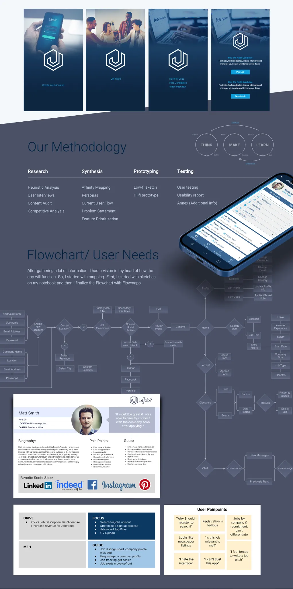
Think. Make. Learn.
The process moved from research and synthesis into sketching, low-fidelity wireframes, interactive prototypes, and usability testing. User flows mapped how candidates could register, build a profile, search for work, apply, and communicate within the app.
Exploring these interactions before refining the visual interface helped identify friction points and establish a consistent, task-focused navigation structure.
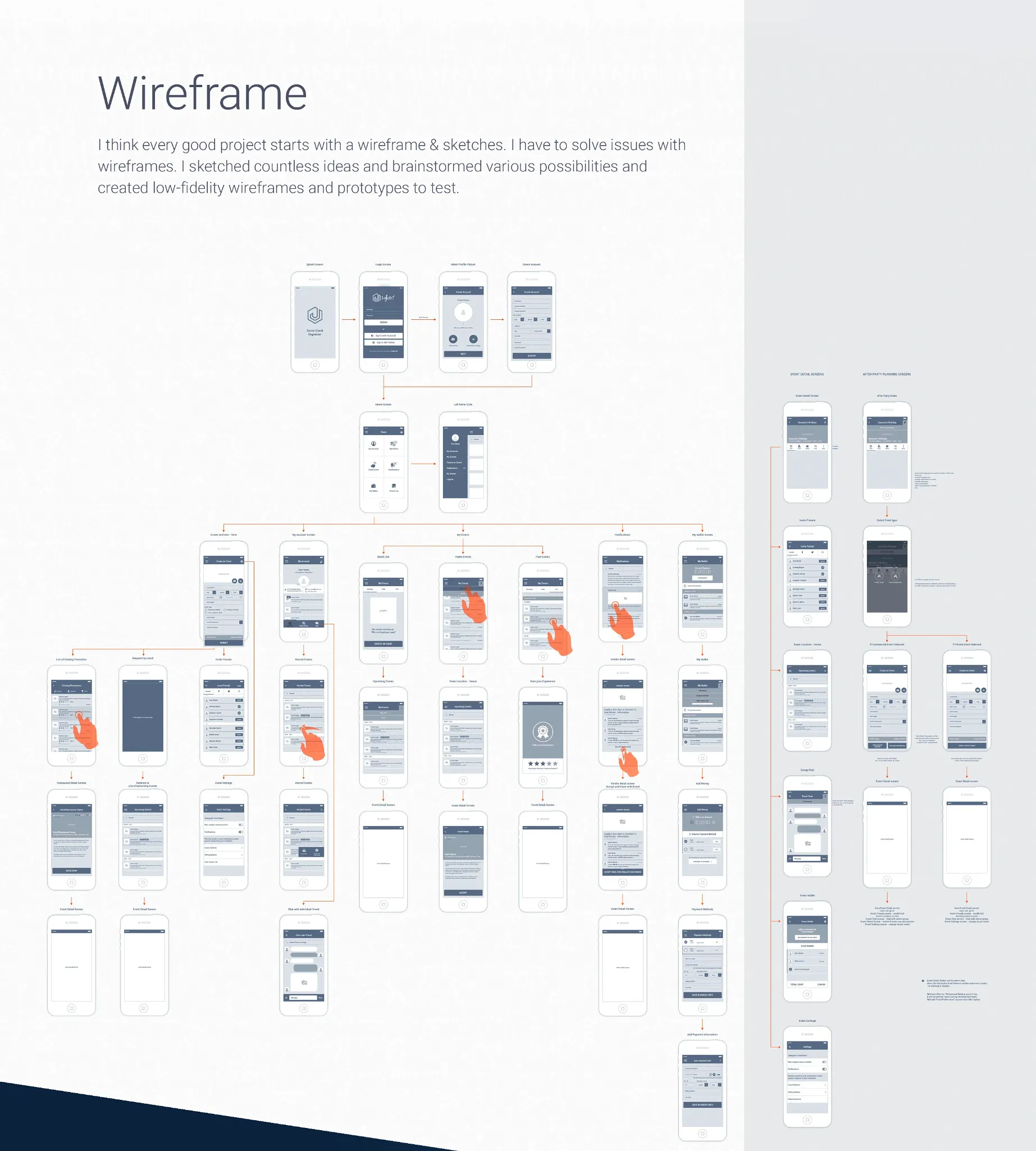
Make every interaction count.
The proposed experience allows candidates to specify their interests and job criteria early, so they can focus on relevant opportunities. Structured profiles and preliminary screening questions are intended to help recruiters understand candidate suitability before scheduling additional conversations.
The interface concepts also explore applicant views, job listings, account details, notifications, and communication features, organized around straightforward mobile workflows. These are design intentions illustrated by the project, not claims of measured product outcomes.
Consistent from screen to screen.
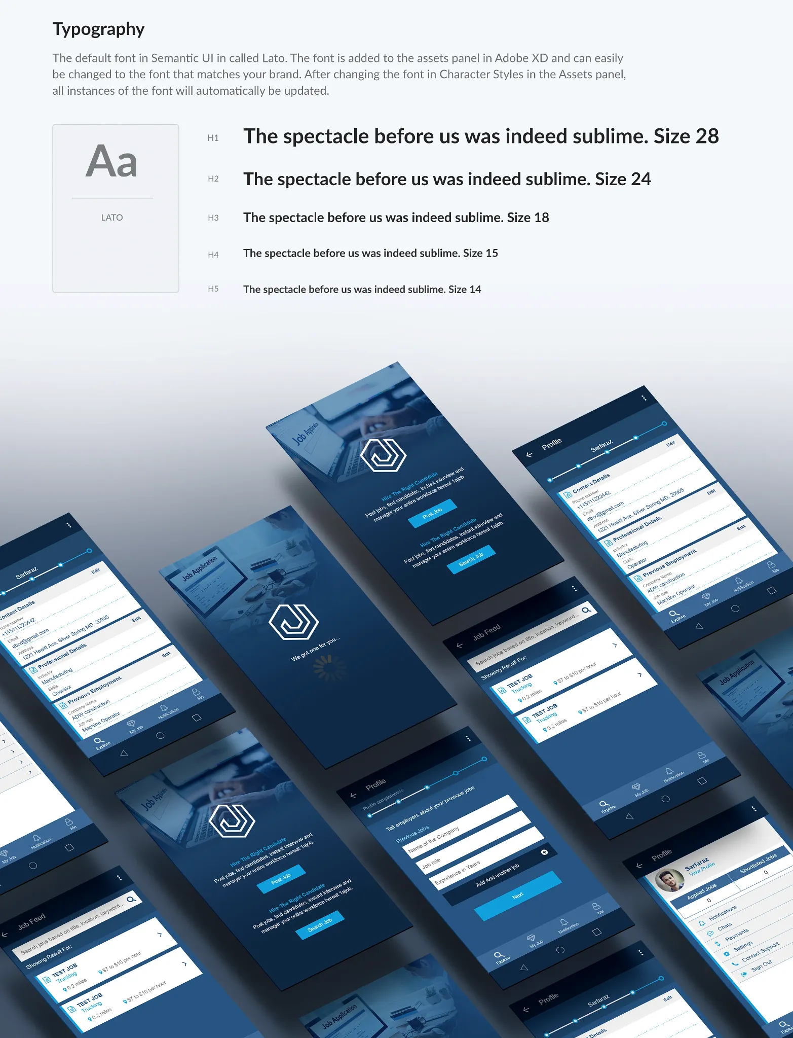
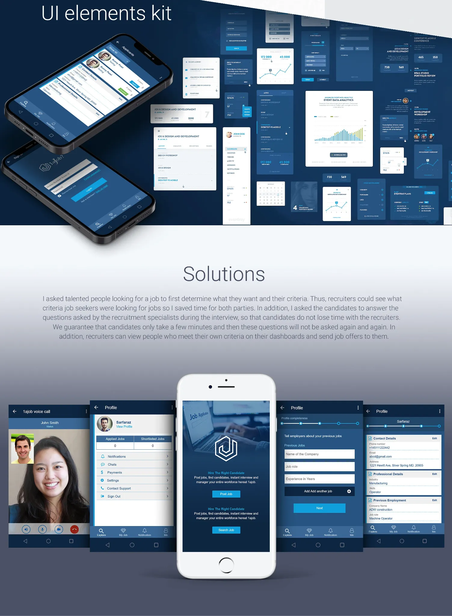
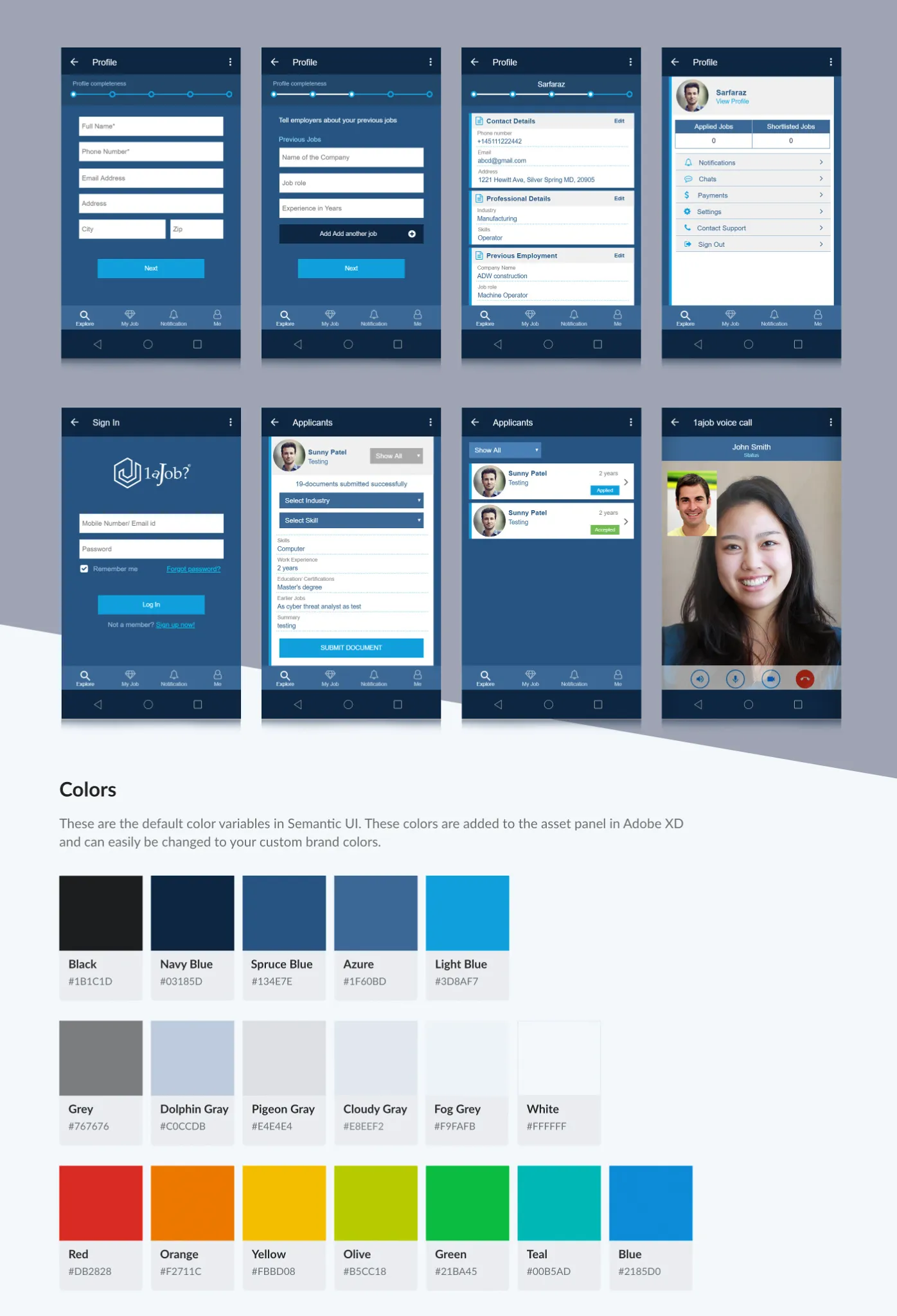
A blue-led interface palette, restrained typography, clear field labels, reusable components, and consistent navigation patterns give the app a cohesive identity. Screen designs demonstrate profile management, sign-in, applicant information, and communication experiences.
Typography, color variables, and UI elements were documented to support consistency and efficient refinement as the interface evolves.