CACI Internal Portal.
An employee-focused interface design study connecting research, information architecture, iterative prototyping, and visual storytelling.
A connected employee experience.
The CACI Internal Portal design study explores a centralized destination for company news, organizational information, employee resources, HR and benefits, and useful shortcuts. The goal of the interface direction was to make varied internal content easier to discover through clear navigation and a consistent page structure.
The project artwork documents the progression from user and task analysis to information architecture, sketches, homepage prototypes, and device-based presentation.
Understand people and their tasks.
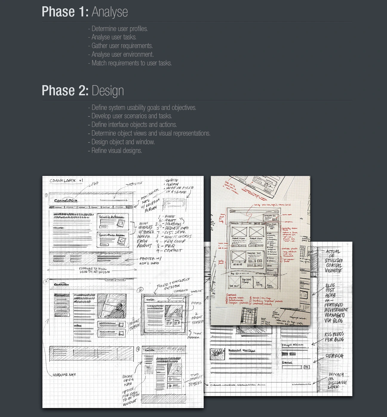
The first phase identifies user profiles, analyzes tasks and the working environment, gathers requirements, and aligns those requirements with real user needs. This provides the foundation for an employee portal organized around practical information-seeking tasks.
The next phase translates the findings into usability goals, user scenarios, interface objects, page views, and refined visual directions.
Give every destination a place.
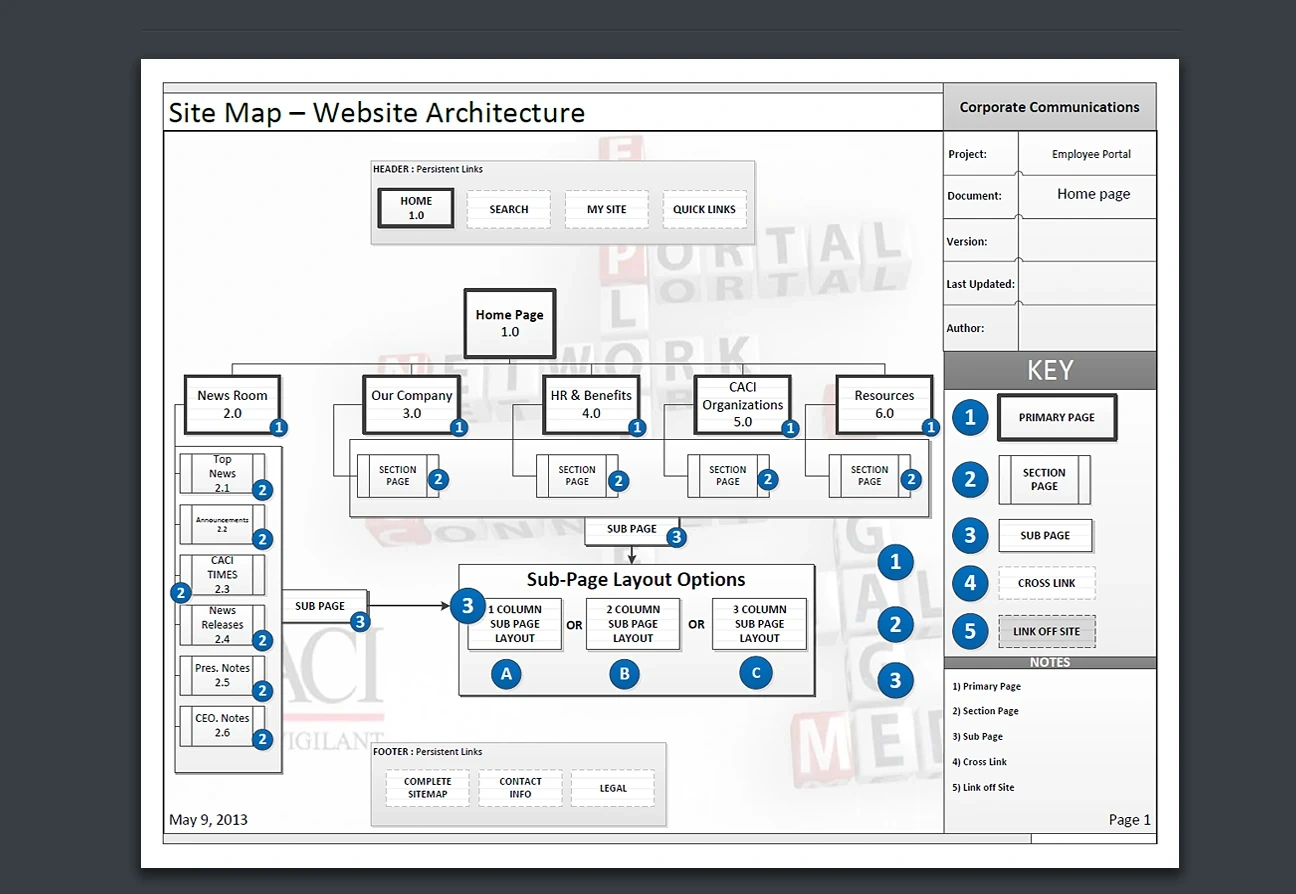
The sitemap organizes the portal around major sections such as Newsroom, Our Company, HR & Benefits, CACI Organizations, and Resources, with persistent search and quick links. It also explores subpage layout options to support different content types.
Establishing this hierarchy before finalizing the interface helps create a more predictable experience across sections.
Explore before committing.
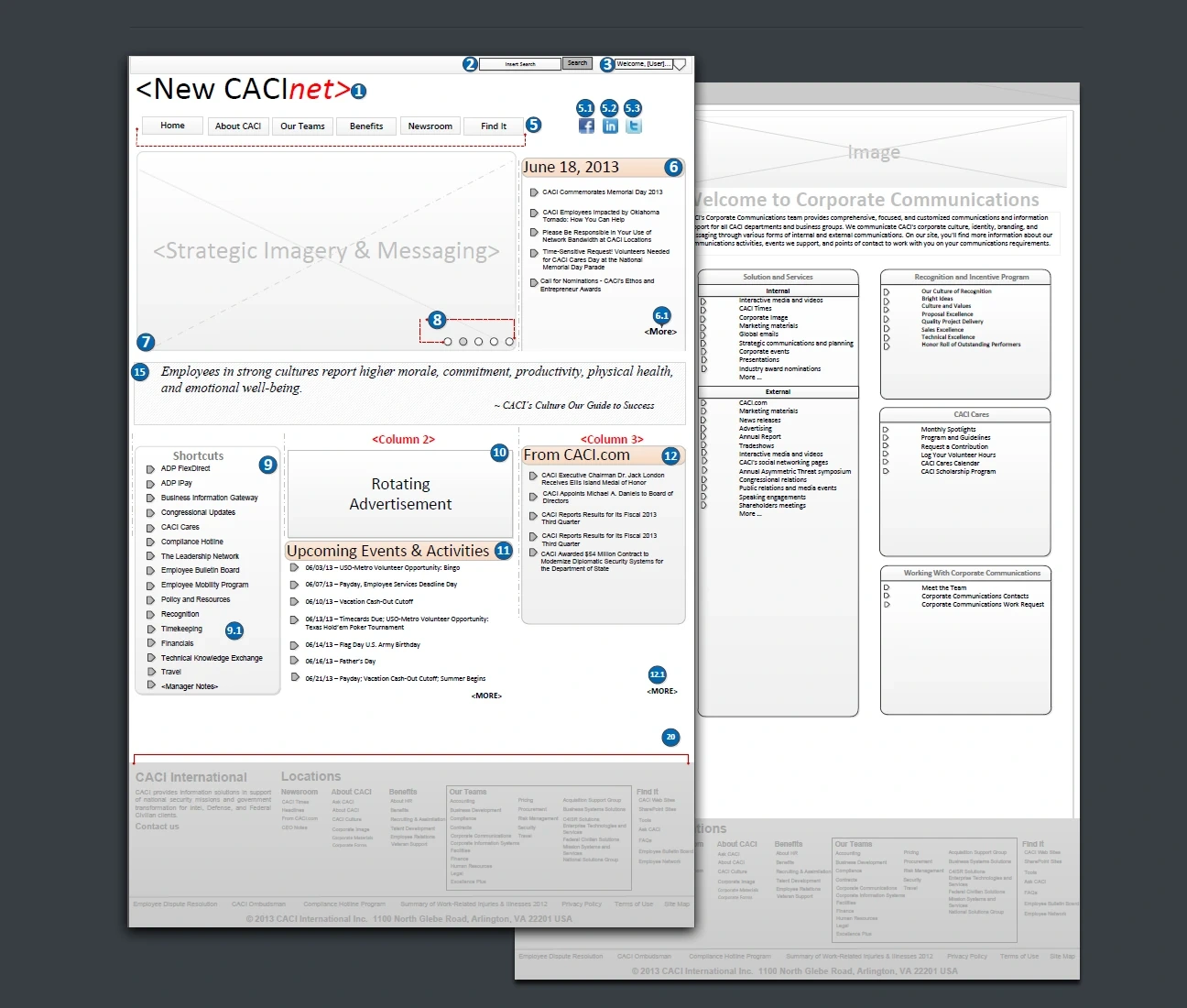
Early sketches and annotated wireframes examine navigation, content placement, prominent messaging, rotating features, employee shortcuts, news, and upcoming events. These exploratory layouts provide a way to evaluate structure and visual priorities before committing to a polished design.
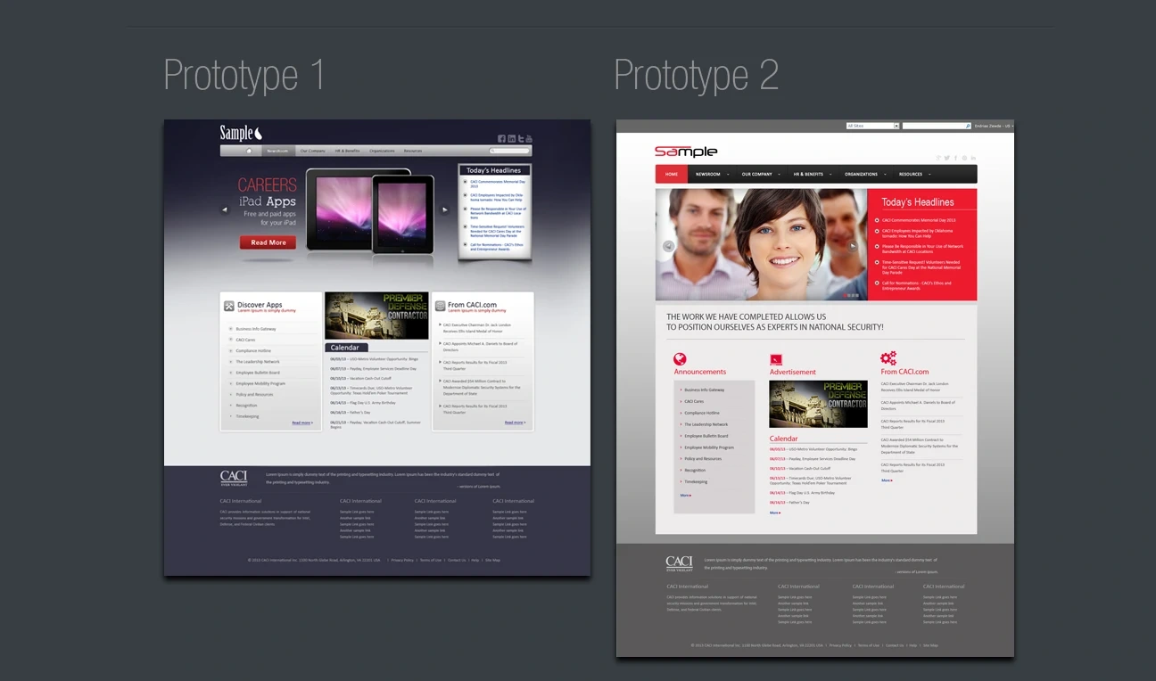
Two directions. One purpose.
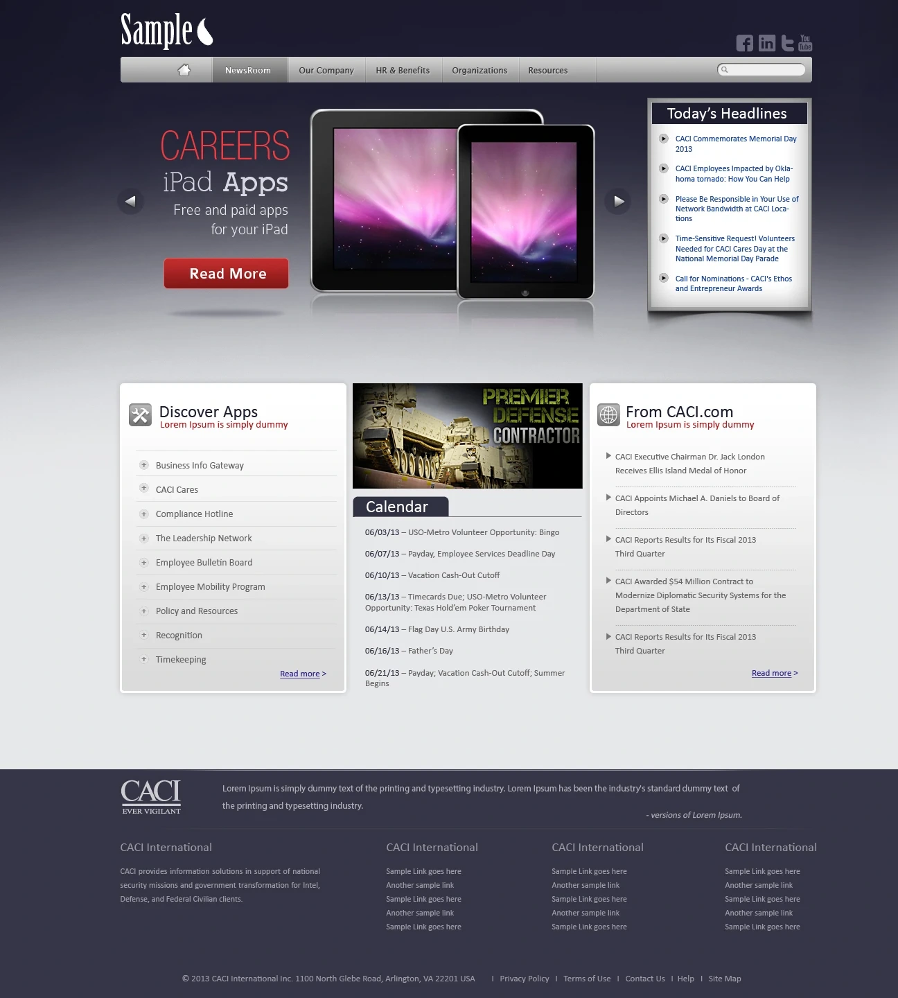
Two homepage concepts demonstrate alternative approaches to the same employee portal requirements. Both explore featured content, announcements, company resources, and information panels while varying the visual hierarchy, imagery, and use of color.
The refined screen studies emphasize recognizable navigation, scannable content groups, and a clear relationship between company-wide information and employee-specific tasks.
Designed across screens.
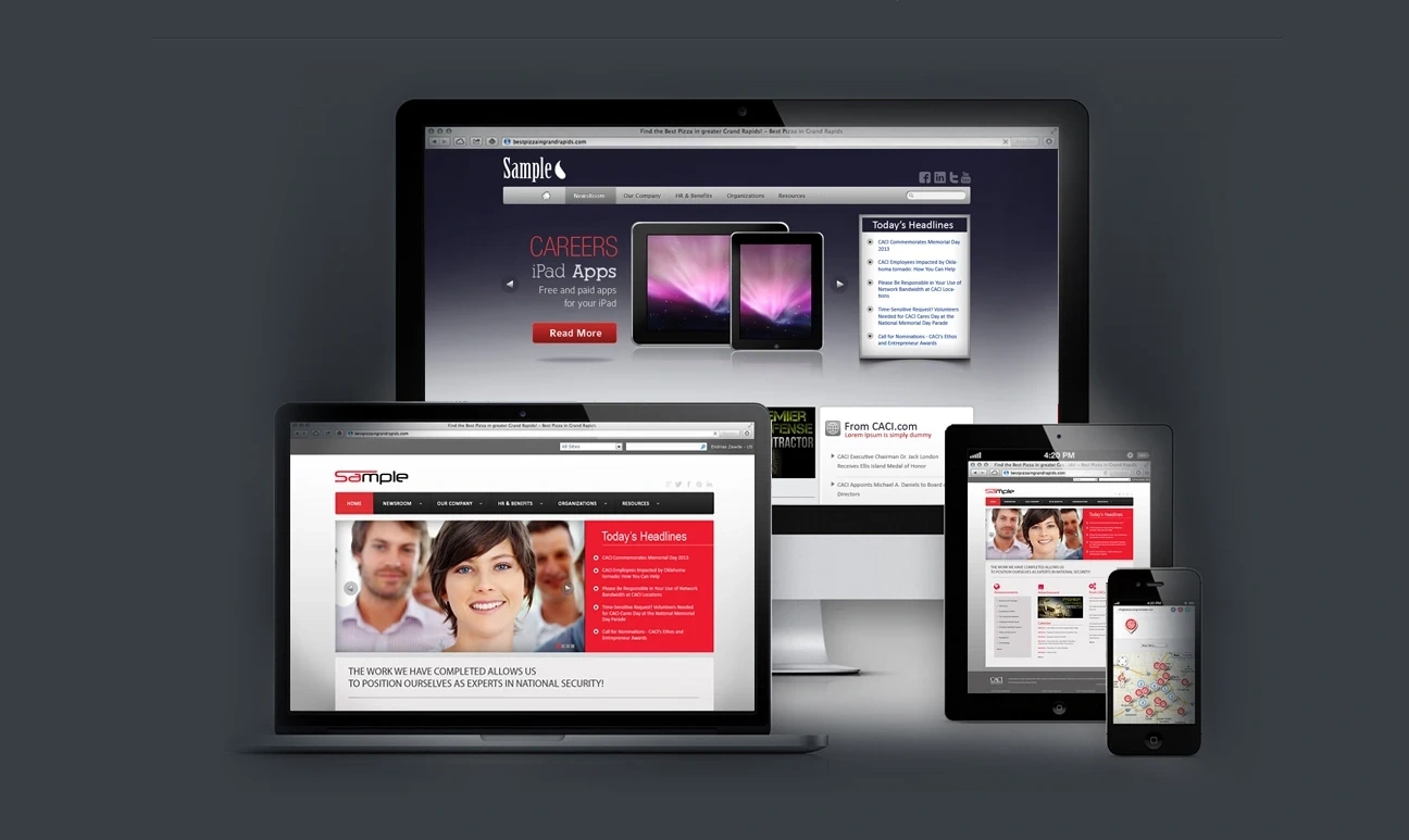
The device mockups show how the portal concepts could be presented across desktop, laptop, tablet, and mobile contexts. They illustrate the intended adaptability of the visual system; they are design presentations rather than a claim of tested production responsiveness.